02/ 04 · Website redesign · Custom landing page · AI video
Hippocrates Wellness
A full UX/UI redesign of an established wellness website, with one page that goes further: a custom-built landing for the Life Transformation Program, told through scrolling around an AI-generated video.
01Overview
The project
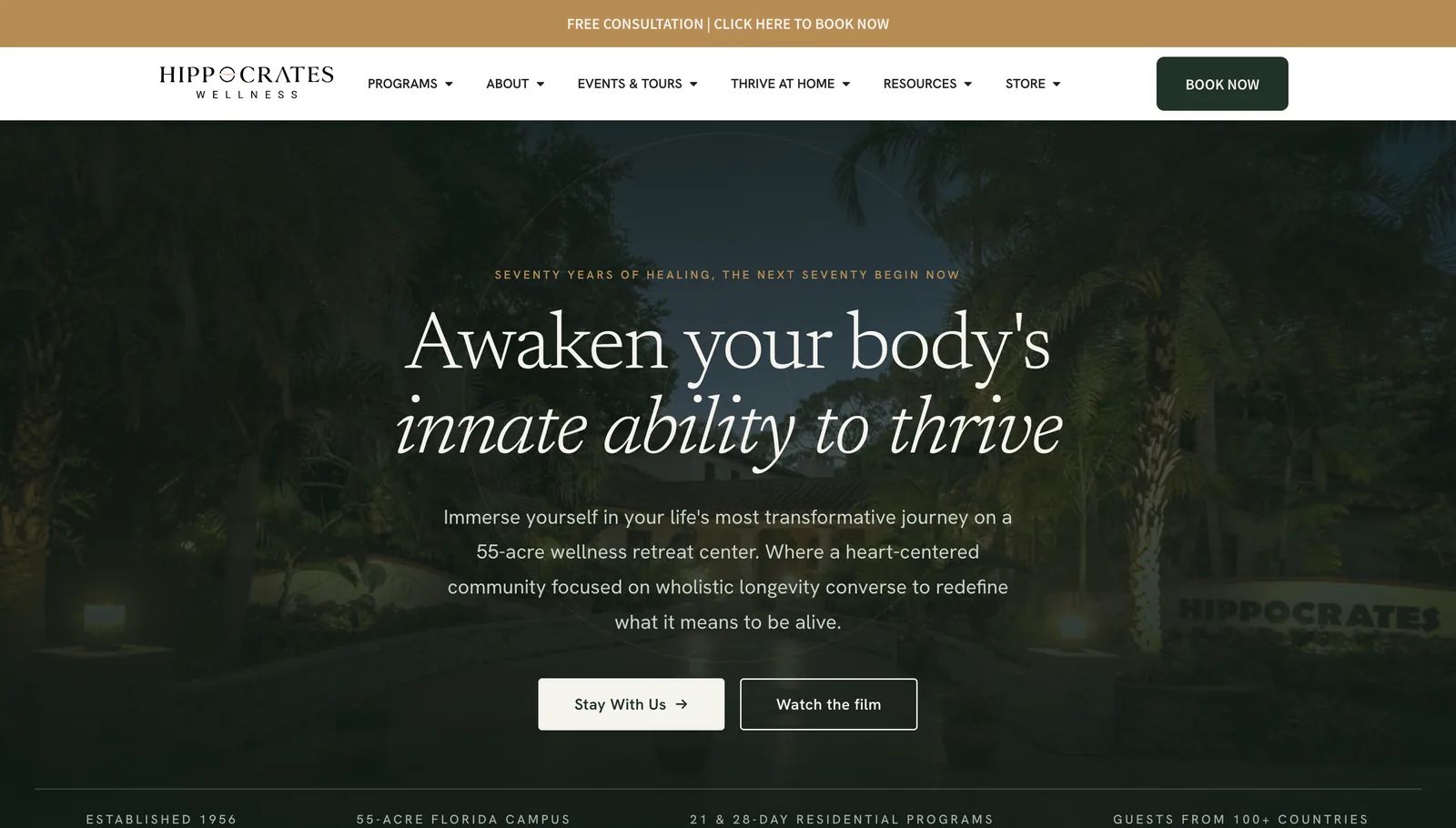
Hippocrates Wellness is a residential wellness center in Florida, established in 1956, offering 21 and 28-day programs to guests from all over the world.
Together with my team at .beeasy, I redesigned the UX and UI of the entire website, which already existed: a multi-page WordPress and Elementor redesign focused on content clarity and clear paths to booking a stay or talking to the team.
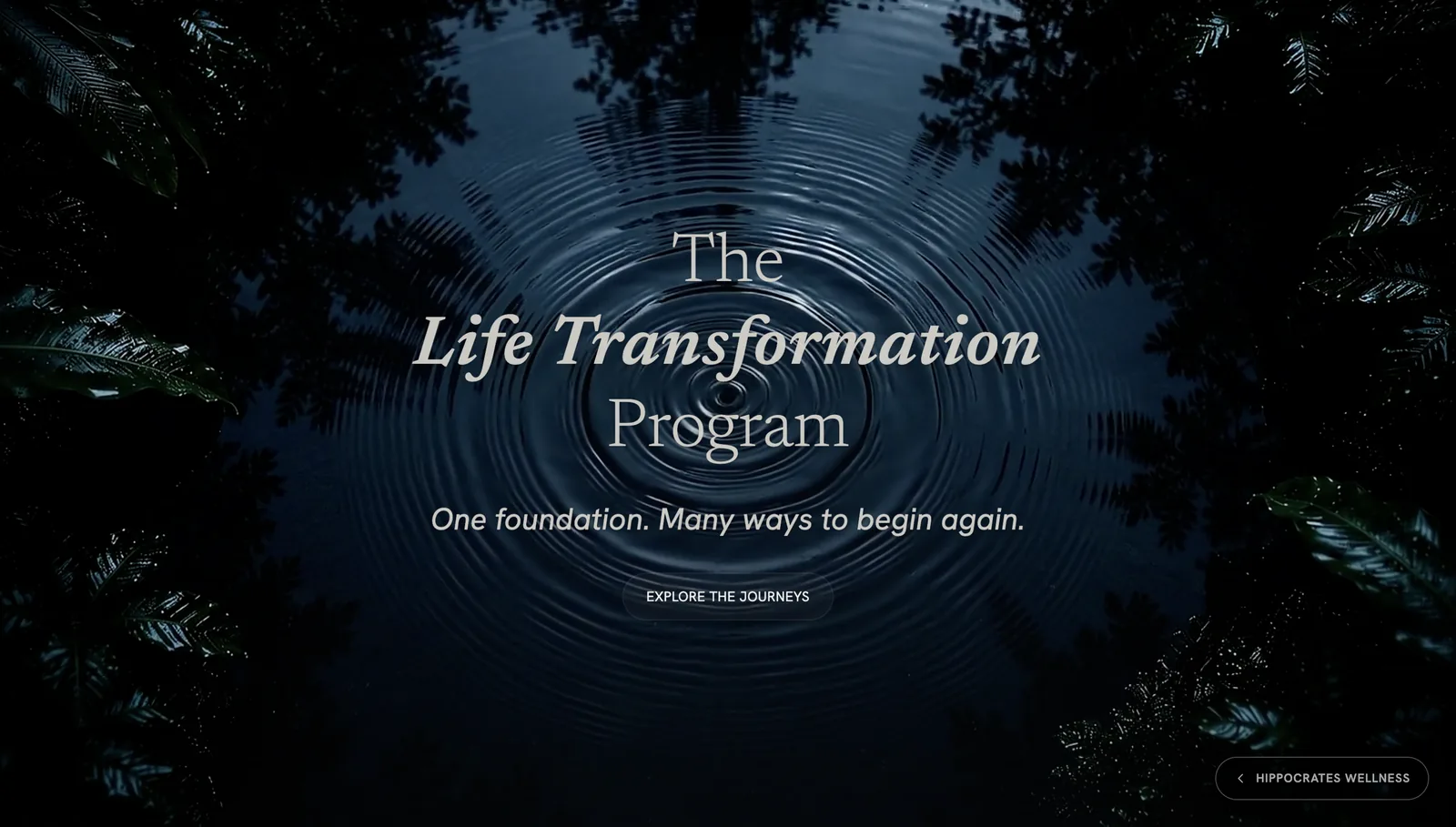
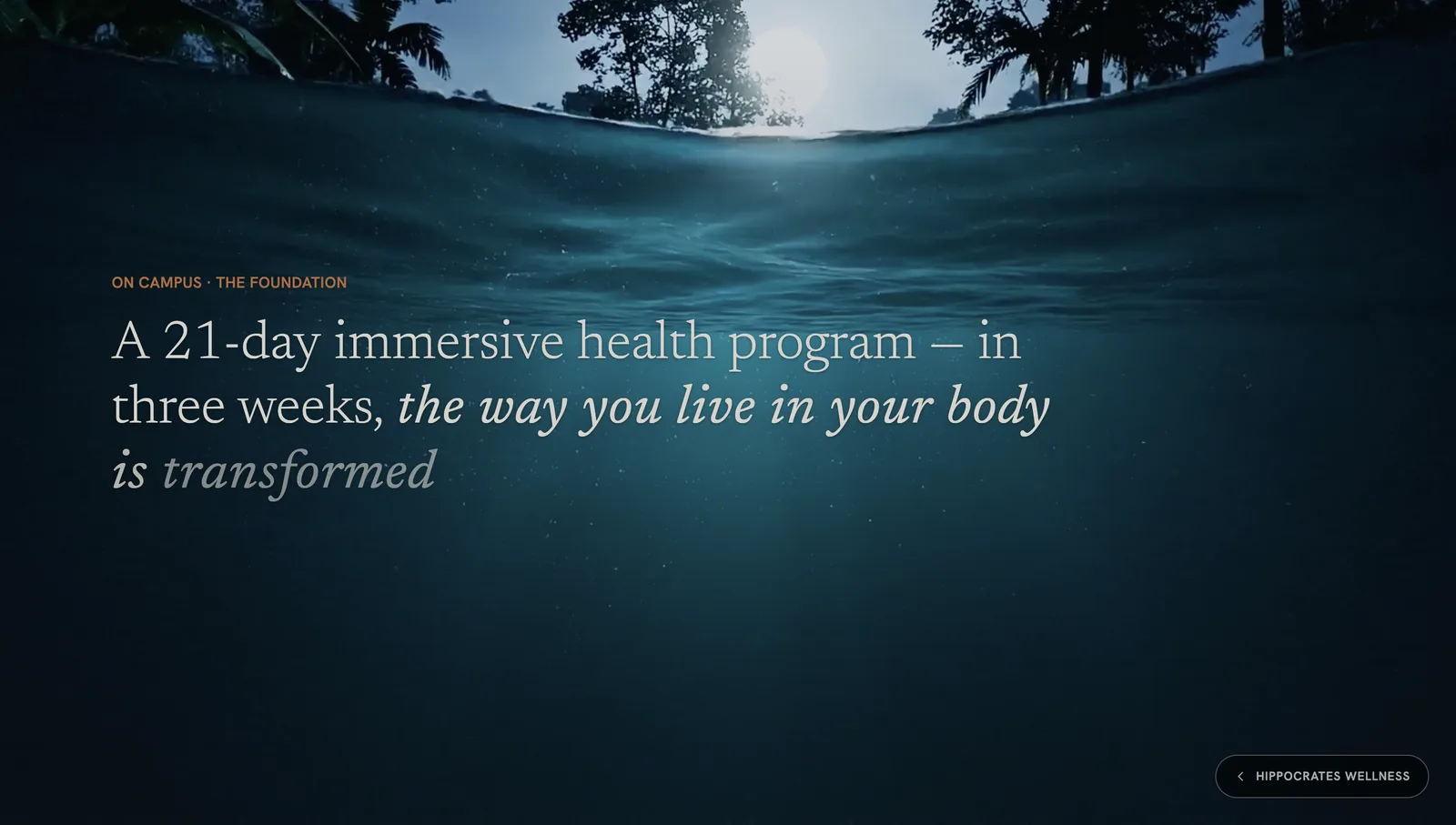
Within the redesign, one page needed custom development and is where the work goes furthest: the landing for the Life Transformation Program, the foundation every journey builds on. It tells the program as a story, with an AI-generated video synchronised with the scroll that carries the visitor from a ripple on the water to the world beneath it.
02Role & responsibilities
What I did, and what I didn't
My responsibilities
- UX/UI redesign of the entire existing website, with my team at .beeasy
- Page structures and reusable components across the site
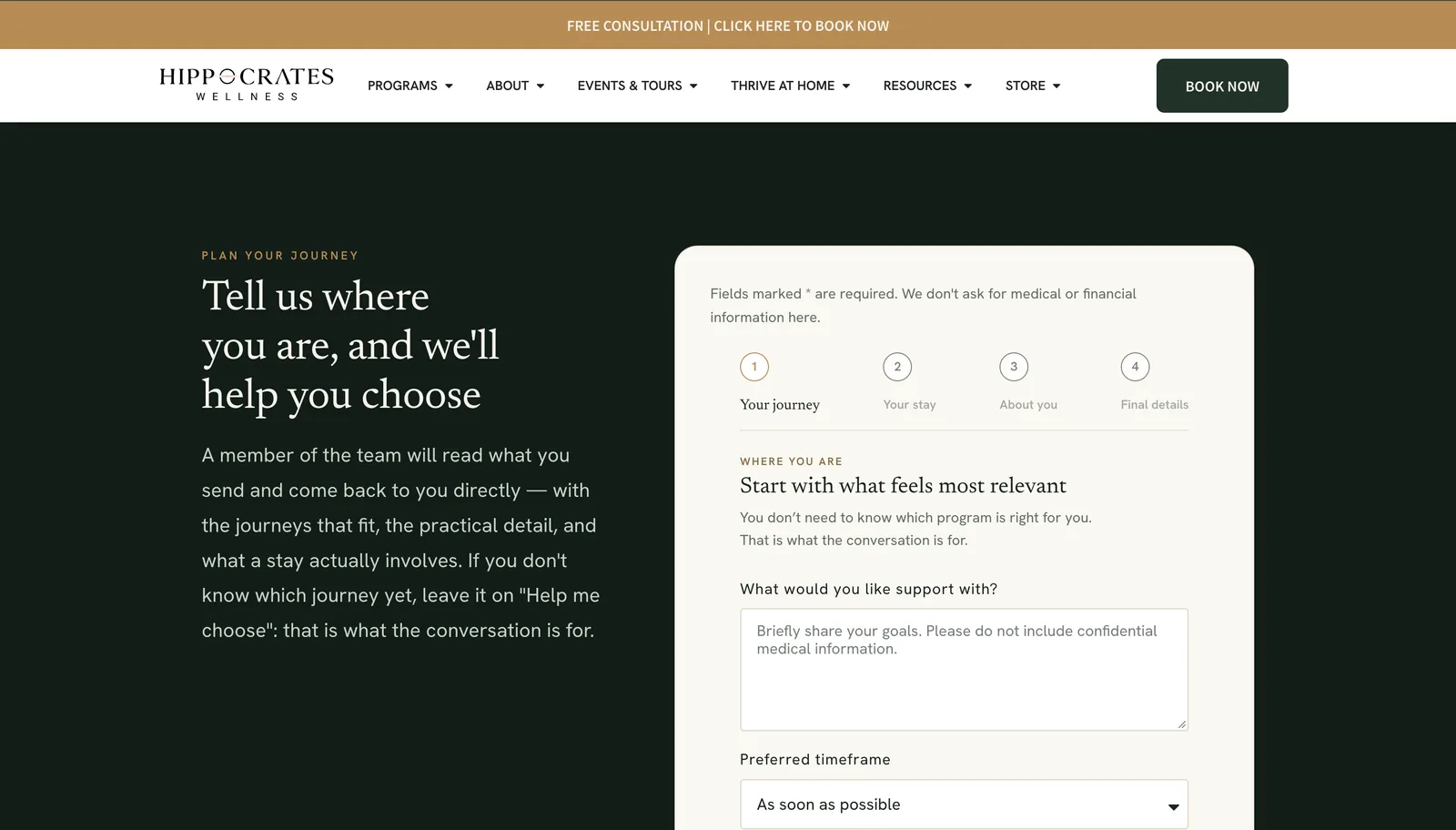
- The “Plan your journey” request flow
- Custom-developed landing page for the Life Transformation Program
- Generating the hero video with Google Veo, synchronised with the scroll
- Elementor components generated with AI assistance, then reviewed and refined
Not my part
- Brand identity and photography
- Program content and health information
03Challenge
The problem
Redesign an established site, and give its foundation program a page worthy of it.
Hippocrates has decades of history, many programs and a lot of content. The redesign had to make that content clear, keep a calm and credible tone, and give people straightforward paths to book a stay or talk to the team.
Inside it, the Life Transformation Program needed more than a standard page. It is the base of every stay, with seven journeys built on top of it, and the page had to make that structure feel like an experience rather than a list.
Everything also had to stay editable by the internal team after launch.
04Approach
How I approached it
I worked on two levels. Across the whole site: structure and consistency, with one typographic voice, reusable page structures, components the team can manage in Elementor and a clear call to action on every page.
For the program landing, I went further with custom development: a story told through scrolling, where the AI-generated video follows the visitor’s scroll, from the ripple on the water to the light beneath the surface, and the copy is paced to the same rhythm, one idea per screen.
The site
Structure, typography and components across every page.
The landing
Custom development for the foundation program.
The video
Generated with Google Veo and synchronised with the scroll.
The handover
Components the internal team can keep editing.
05Design decisions
The decisions that shaped it
Across the site, headlines pair an upright serif with its italic: the italic carries the emotional line, the roman frames it. The same voice runs from the homepage to the program pages and the booking form.
The homepage states the essentials in one strip under the hero: established 1956, a 55-acre Florida campus, 21 and 28-day residential programs, guests from more than 100 countries. Credibility comes from facts, not adjectives.
“Plan your journey” says up front that you don’t need to know which program is right for you, and that it won’t ask for medical or financial information. Four named steps show the length of the request before it starts.
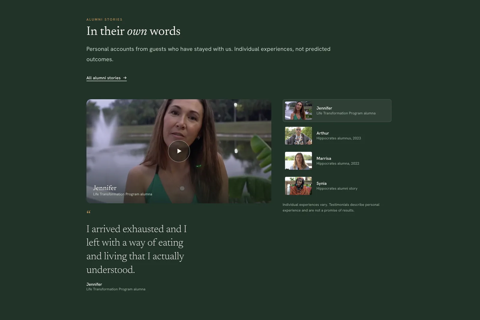
Alumni videos are introduced as individual experiences, not predicted outcomes, with names and programs listed beside the player. In a health context, the framing matters as much as the testimonial.
The landing’s hero video was generated with Google Veo and is synchronised with the scroll. The visitor sets the pace: scrolling down takes them beneath the surface, the same immersion the program promises. Getting there meant directing Veo towards a precise image (the water, the light, the ferns framing the scene) and keeping only the results that matched it.
The opening shows the water from above; the next screens continue beneath the surface, where the 21-day program is introduced. The transition carries the idea of immersion without having to explain it.
Format, what it’s included in, and length sit in a three-column strip between two rules. Those are the facts people need to decide, so they are the easiest thing on the card to scan.
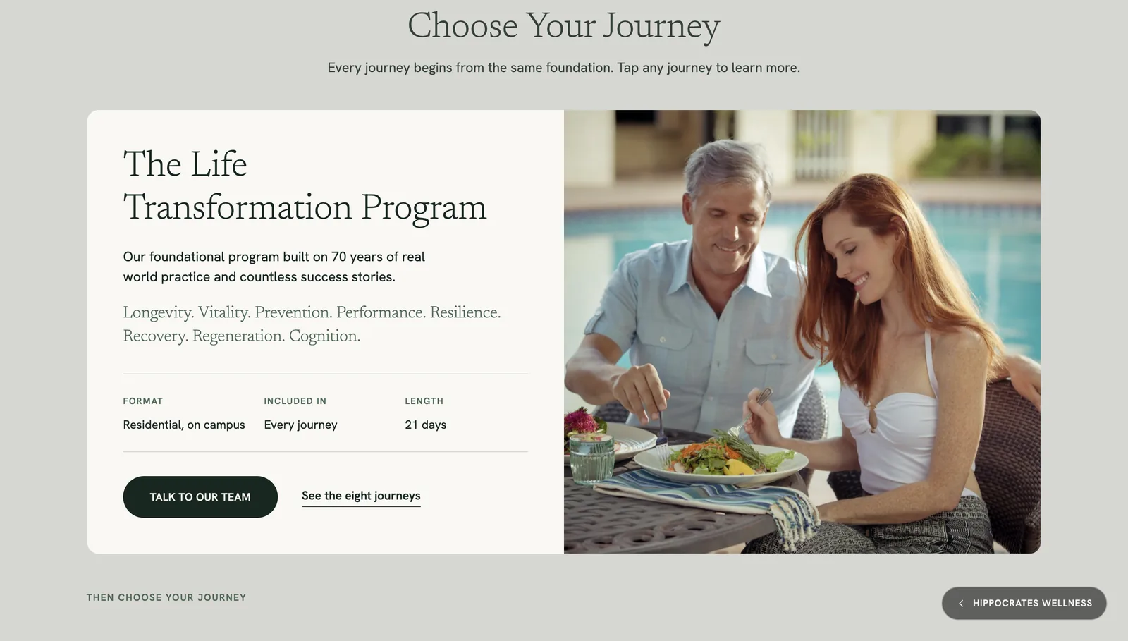
Sections are Elementor components the internal team can edit. Text, images and order change in the editor, without touching code.
06Development
How it was built
The site runs on WordPress with Elementor Pro. For the redesign I used AI to generate first versions of custom Elementor components, then reviewed each one against the design (spacing, typography, responsive behaviour, editability), corrected what didn’t match, and integrated it so the people who maintain the site can edit it in Elementor.
The program landing was developed custom. Its video is tied to the scroll position, so it moves forward as the visitor scrolls down and back as they scroll up, while the page around it stays light so the story reads smoothly.
- Platform
- WordPress · Elementor Pro
- Landing page
- Custom development
- Hero video
- Generated with Google Veo, synchronised with the scroll
- Editing
- Components managed by the client’s team
07Final experience
The live screens
Screenshots of the live site, unedited.
08Takeaways
What I'd keep
Redesign for the whole, invest in one page.
A consistent site lets one exceptional page stand out instead of competing.
Let the scroll tell the story.
When motion follows the visitor, it stops being decoration and becomes the narrative.
AI drafts, people decide.
Generated video and components were a starting point; the review is where they became usable.
Have a story that deserves more than a template?
Whether it’s a full redesign or one page that needs to go further, tell me what you have in mind.