03/ 04 · SaaS websites · Web design & Webflow
Beefree SDK & RGE Studio
Selected pages and reusable components for an email-design SaaS ecosystem, designed and built in Webflow inside an established brand.
01Overview
The project
Beefree makes tools for designing emails and landing pages. Its email builder is now RGE Studio, part of Really Good Emails, and Beefree SDK is the embeddable builder for software companies.
I designed and developed selected pages and components on these websites in Webflow. This case study covers three of them: the RGE Studio demo request page, the enterprise security section and the Beefree SDK pricing page.
02Role & responsibilities
What I did, and what I didn't
My responsibilities
- Page design within the existing brand
- Webflow development of the pages and their components
- Reusable components and content structures
- Responsive layouts and accessibility-aware implementation
- Accessibility improvements across the sites over the past year
- Code cleanup in the Webflow builds
- Implementing SEO changes from the SEO agency’s audits
Not my part
- The brand and the overall website design
- The products and their interfaces
- Copy, pricing and product claims, including the metric and testimonial shown on these pages
03Challenge
The problem
Several products, several audiences, one brand, and many hands on the same site.
Product-marketing pages for a SaaS company change often: new plans, new features, a rebrand. They are maintained by distributed teams, so every page has to be built from parts other people can reuse and update.
Each page also has a single job, whether that’s requesting a demo, reassuring a security reviewer or comparing plans, and the layout has to make that job obvious.
04Approach
How I approached it
I worked inside the existing system: pages assembled from reusable Webflow components, a consistent structure from page to page, and one clear action per page.
05Design decisions
The decisions that shaped it
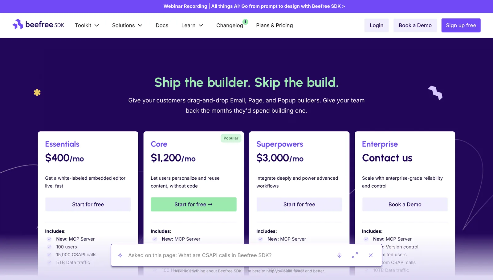
Four plans share the same structure: name, price, one-line promise, action, then what’s included. Only the recommended plan has a filled button, and a “Popular” label says why, so the emphasis doesn’t rely on colour alone.
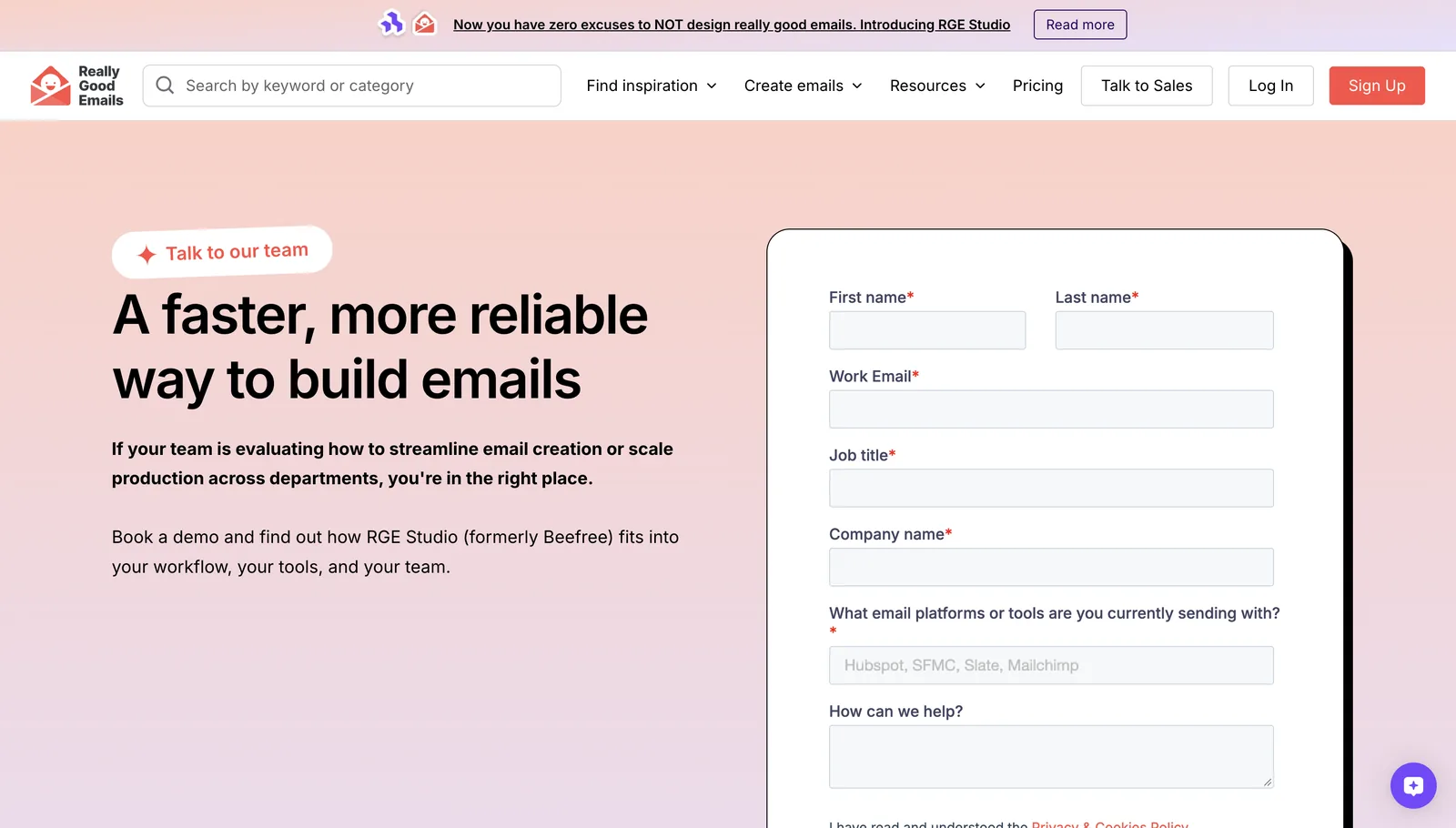
On the RGE Studio demo page the argument sits on the left and the form on the right, inside a framed card that reads as the page’s single action. Every field has a visible label, and required fields are marked.
The enterprise security section answers a reviewer’s checklist in a two-by-two grid: a heading in the accent colour and one sentence each, with a link to the trust center for the detail.
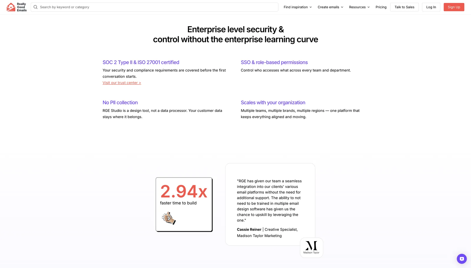
Sections were built as reusable Webflow components, so the same structures can be recombined on other pages and stay consistent as the brand evolves.
06Development
How it was built
Built in Webflow with reusable components and shared classes, responsive across breakpoints, with accessibility considered in the markup: labelled form fields, heading order, contrast.
Working with distributed teams meant designing for hand-off: clear structure and naming, so the next person can edit a section without breaking it.
Over the past year my work has also gone beyond single pages: improving the accessibility of these sites, cleaning up their code, and implementing the SEO changes recommended in the audits from the client’s SEO agency.
- Platform
- Webflow
- Building blocks
- Reusable components · shared classes
- Ongoing
- Accessibility · Code cleanup · SEO from agency audits
- Team
- Distributed product and marketing teams
07Final experience
The live screens
Screenshots of the live site, unedited.
08Takeaways
What I'd keep
Inside a system, consistency is the design.
The best new page is one that looks like it was always there.
One page, one job.
Every layout decision followed from the single action the page exists for.
Need pages that fit your system?
I design and build in Webflow with reusable components, accessibility and SEO in mind, inside the brand you already have.